Matplotlib basics
Posted on March 8, 2019 at 13:00 PM
In this tutorial we take a look at the basic features of the Python package Matplotlib. Matplotlib is used to create beautiful graphs from your data and is essential part of the data science tool kit
What is Matplotlib?
Matplotlib Basics is a library used for scientific computing. Matplotlib makes graphically representing your data easier in the form or line graphs, bar charts, histograms and much more.
Matplotlib basics
Matplotlib comes installed with the Python download - as with all packages you must import them into your script; the convention is "import matplotlib.pyplot as plt":
import matplotlib.pyplot as plt
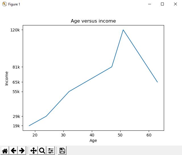
Once imported, you can plot two lists against one another very simply. Note, for this example I have just made up some random data for age and income. Additionally, you can then customise the graph using colours, labels and ticks (used to replace axis labels to be more readable / relevant). Note, you must always finish by telling python to show the graph.
>>>import matplotlib.pyplot as plt
>>>
>>>age = [18,24,32,47,51,63]
>>>income = [19000,29000,55000,81000,120000,65000]
>>>
>>>plt.plot(age,income)
>>>
>>>plt.xlabel('Age')
>>>plt.ylabel('Income')
>>>plt.title('Age versus income')
>>>plt.yticks([19000,29000,55000,81000,120000,65000],["19k","29k","55k","81k","120k","65k"])
>>>
>>>plt.show()
>>>
Other graphs
Scattergrams
With a bit of simple customisation of the above code, we can make a variety of graphs. Replace "plt.plot()" to "plt.scatter()" to change from a line graph to a scatter graph - note I have commented out the first line below.
>>>#plt.plot(age,income)
>>>plt.scatter(age,income)
Histograms
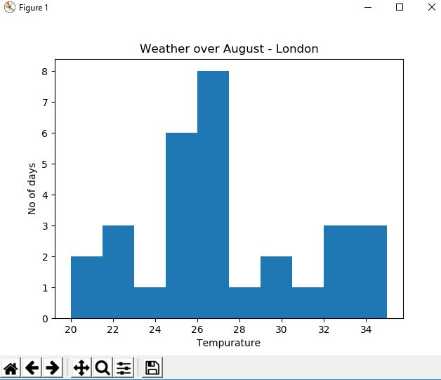
Histograms bucket data together and graph based upon the count within each bucket. For histograms we need a slightly different data set; imagine this is average daily weather temperature records for August in London (again, this is made up data).
>>> import random
>>> weather = [random.randint(20,35) for x in range(30)]
>>> weather
[20, 30, 31, 35, 35, 23, 32, 20, 25, 30, 30, 33, 29, 27, 23, 33, 28, 25, 33, 33, 32, 35, 28, 35, 26, 32, 22, 29, 35, 35]
>>>
>>>plt.hist(weather) # you can add a parameter to change the number of buckets, i.e. plt.hist(weather,5)
>>>plt.xlabel('Tempurature')
>>>plt.ylabel('No of days')
>>>plt.title('Age versus income')
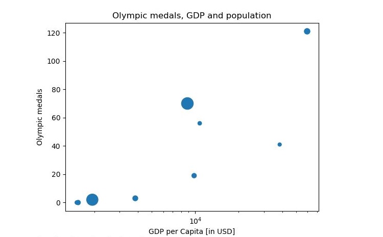
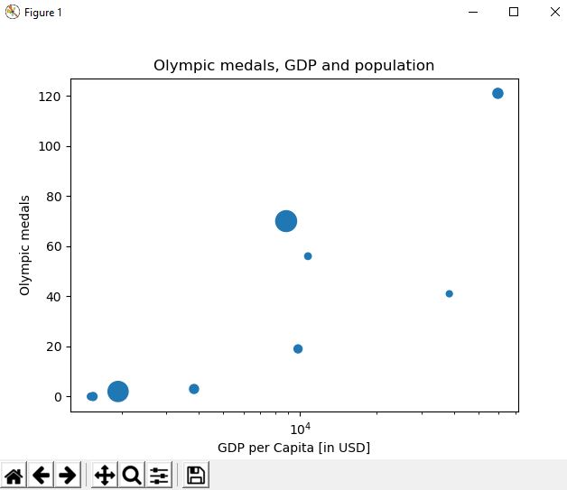
Bubble graphs
The final graph we will look at is a bubble graph; these show 3 data points on a single graph. For this graph we will look at medals at the Olympic games, GDP and population. Note, this is essentially the same as a scatter graph although we pass in a size "s=" in the parameter in the form of a NumPy array - this could be a list, however the bubbles were too small thus it was converted and increased in size.
>>>olympic_medals = [41,56,0,1,0,19,3,121,2,70]
>>>gdp_per_capita = [38428, 10743, 1516, 1968, 1547, 9821, 3846, 59531, 1939,8826]
>>>population = [1.2,1.4,1.5,1.9,2.07,2.08,2.6,3.2,12.9,13.8]
>>>np_population = np.array(population)
>>>np_population = np_population * 20

>>>plt.scatter(gdp_per_capita,olympic_medals, s=population)

>>>plt.xscale('log')
>>>plt.xlabel('GDP per Capita [in USD]')
>>>plt.ylabel('Olympic medals')
>>>plt.title('Olympic medals, GDP and population')

>>>plt.show()
Code takeaway
The majority of the code is blanked out, although uncommenting certain parts will show a variety of different graphs.
import matplotlib.pyplot as plt
import numpy as np

# LINE GRAPH
#age = [18,24,32,47,51,63]
#income = [19000,29000,55000,81000,120000,65000]
#plt.plot(age,income)
#plt.scatter(age,income)
#plt.xlabel('Age')
#plt.title('Age versus income')
#plt.yticks([19000,29000,55000,81000,120000,65000],["19k","29k","55k","81k","120k","65k"])
#plt.show()

# HISTOGRAM
# create some random data for weather
#import random
#weather = [random.randint(20,35) for x in range(30)]
#plt.hist(weather) # you can add a parameter to change the number of buckets, i.e. plt.hist(weather,5)
#plt.xlabel('Tempurature')
#plt.ylabel('No of days')
#plt.title('Weather over August - London')
#plt.show()

# BUBBLE GRAPH
olympic_medals = [41,56,0,1,0,19,3,121,2,70]
gdp_per_capita = [38428, 10743, 1516, 1968, 1547, 9821, 3846, 59531, 1939,8826]
population = [1.2,1.4,1.5,1.9,2.07,2.08,2.6,3.2,12.9,13.8]
np_population = np.array(population) # pass list into a NumPy array
np_population = np_population * 20 # Increase the size of the bubbles
plt.scatter(gdp_per_capita,olympic_medals, s=population)
plt.xscale('log')
plt.xlabel('GDP per Capita [in USD]')
plt.ylabel('Olympic medals')
plt.title('Olympic medals, GDP and population')
plt.show()